USPS
The core value of the Postal Service is serving the people and businesses with efficiency and security.
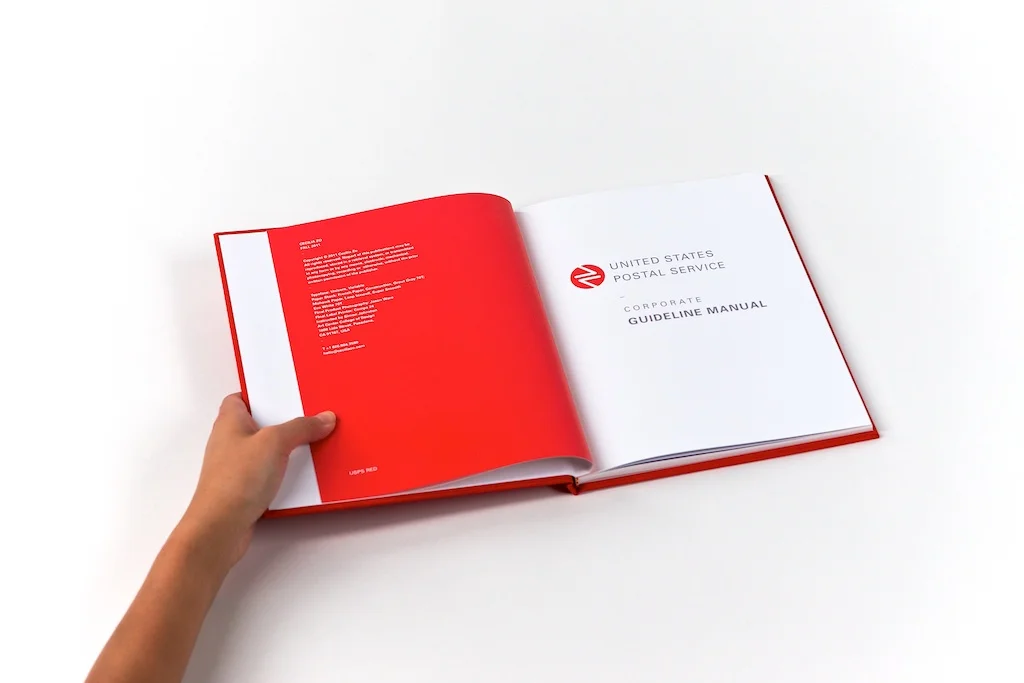
The new USPS identity communicates the revolution in technology with tone of warmth in humanity. It’s invigorating, it’s moving, and it carries the sense of trust and sincerity to represent the corporation with dignity and authority.
The two arrows creating a pathway implies directions and destination, as well as the process of aggregation and distribution. By containing the mark in a seal keeps it visually stable and gives it a sense of trustworthiness.
The red color is chosen to communicate the concept of passion, patriotism, and human connection, while the secondary color, blue, speaks to the efficiency, technology, and communication in which USPS will conduct its business.


Advertising Campaign
This campaign focuses on delivery, the most important part of USPS's service offering, but creates more than just physical goods delivery. It is delivering the intangibles - trust, security, efficiency, punctuality, and authority - to make an emotional connection to so many customers relying on the services of USPS. To reposition the brand to feel more friendly and caring.


